Put the review where the evidence is
The person approves the change on the field it changes.
The product picks where the agent shows up (a floating button, a side drawer, inline in the page, or a separate review page) based on what the person must look at to decide. The proposal stays the same as the review moves between those places.
Why the pattern matters#
A drawer can squeeze a table until the table is unreadable. An inline edit can look small while setting off a message somewhere else. A separate page gives room but loses the surrounding context. No layout is best everywhere; the right one fits the decision.
When to use the pattern#
Use the pattern when
- The decision depends on seeing the real object: an order, a form, a schedule.
- The work spans several records that need room to compare.
- People move between chat, preview, and a full page in the middle of a task.
Skip the pattern when
- A small visible change has a wide effect, like a global style. An inline preview alone would hide the scope, so add a summary of consequences.
- A team is choosing a layout by panel engagement or message counts. More messages can mean interest or confusion.
What each place is good for#
One job can use several places: an entrance for the request, a conversation to clarify, a review of the change, and a record afterward. When the review moves, the proposal’s ID, scope, version, and pending decision move with the review, not just the last message.
| Place | Good for | Watch for |
|---|---|---|
| Floating button | Work that spans several objects, like finding the conversations that need follow-up | Which context the agent is using, and whether a selection went stale as the person browsed |
| Side drawer | Asking questions while looking at the product | Width: the drawer can squeeze the table under review until the table is unreadable |
| Inline in the page | Small edits next to the real object, old value beside new | A small visible change with a wide effect, like a message or a global style |
| Dedicated review page | Bulk changes with exceptions, long investigations, decisions passed between teammates | Distance from the task: keep links to the objects, the request, and why the decision is waiting |
| Phone notification | A narrow, well-understood decision | A one-tap Approve on a bulk change with hidden exceptions |
In real products#
What each product documents, strongest example first.
- Shopify Sidekick
In a draft order, Sidekick highlights updated fields in purple and marks new line items with an Added badge, so the merchant reviews inside the real order instead of a generic card.
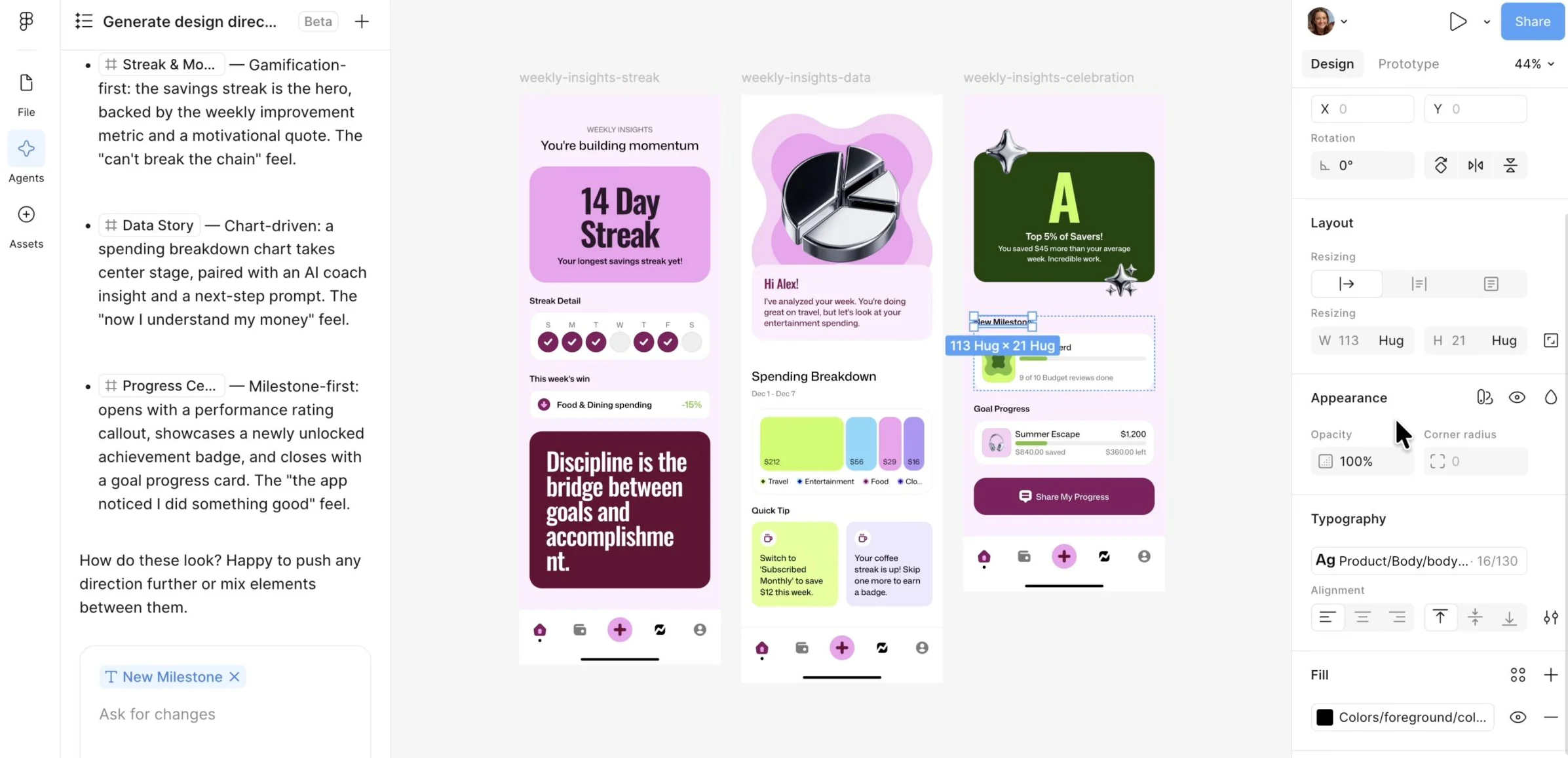
Getting help and guidance from Sidekick - Figma Design agent
Figma’s agent works on the canvas with the team’s real components, tokens, and variables, so a reviewer can select a layer and check what the layer is built from.
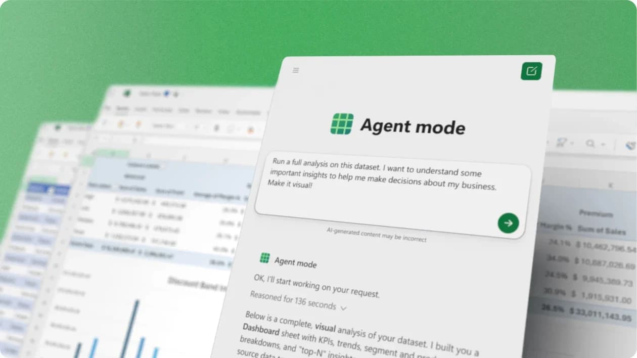
Figma AI design agent - Microsoft Excel agents
Copilot builds with Excel’s own tables, charts, PivotTables, and formulas, so a person reviews the result with Excel’s normal tools: inspect a formula, change an input.
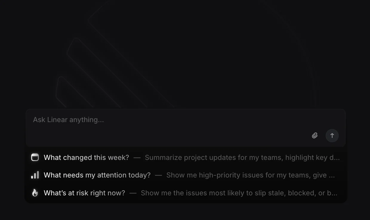
Get started with Copilot in Excel - Linear Agent
Linear’s agent drafts a project update in Linear’s own update composer. The author edits the draft directly, then publishes.
Agent assisted project updates





Sources checked September 28, 2026.
Checklist#
Yes-or-no checks for a design review.
- The person can see the real object, or enough of the object, to decide.
- The screen shows which context the agent is using, like the selected campaign.
- Moving from chat to preview to a full page keeps the same proposal, not a fresh interpretation.
- An inline change with a wide effect comes with a summary of everything the change touches.
- Closing the panel doesn’t cancel the work, and reopening the panel shows the current state.
- Pending decisions and past runs have a home a person can return to.
Try it on your product
Walk one proposal through every place
Take one real proposal and open it everywhere your agent can show it: chat, drawer, inline, a full page, a notification. At each stop, check that the same items, the same exception, and the same pending decision are still visible. Note the first place where a reviewer would have to reconstruct the job.
When the agent works without being asked (on a schedule, or when something happens), a written rule says what the agent may do, where, acting as whom, and who owns the rule.